
Best Practices for Analyzing Calibration Data
Analyzing calibration data ensures measurement accuracy and reliability, which is critical for maintaining quality and compliance in industries that rely on precise instruments. This process involves cleaning, organizing, and interpreting data to identify trends, detect measurement drift, and validate calibration models. Here's what you need to know:
- Calibration Basics: Calibration compares an instrument's readings to known reference standards, creating a mathematical model (e.g., a linear or quadratic curve) to correct inaccuracies.
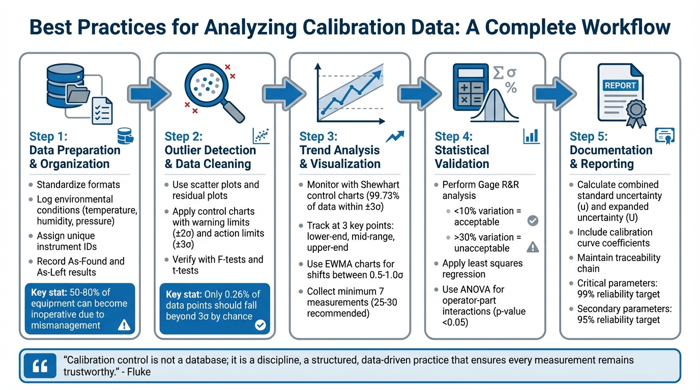
- Data Preparation: Organize raw data by standardizing formats, logging environmental conditions, and ensuring traceability with detailed records.
- Outlier Detection: Use scatter plots, residual plots, and control charts to spot and address data anomalies.
- Trend Analysis: Visualize data with control charts to monitor for drift, shifts, or performance issues over time.
- Statistical Validation: Apply methods like Gage R&R and regression analysis to ensure model accuracy and identify sources of variation.
- Uncertainty Calculation: Combine all error sources to quantify total measurement uncertainty using statistical methods.
5-Step Calibration Data Analysis Workflow for Measurement Accuracy
Calibration Curve Tutorial - Lesson 1 - Plotting Calibration Data
sbb-itb-501186b
Preparing and Cleaning Calibration Data
To ensure accurate calibration, start by organizing your data. This means keeping a detailed inventory of all instruments, assigning each a unique ID, and classifying them based on their importance. This classification is crucial because it allows you to apply stricter controls to equipment that affects product safety or regulatory requirements, laying the groundwork for reliable measurements.
Organizing and Formatting Raw Data
Calibration records need to follow a standardized format for consistency. At a minimum, include the following details: instrument identification (serial number and model), calibration date, "As-Found" results (before adjustment), "As-Left" results (after adjustment), and pass/fail status. Recording "As-Found" data is key to evaluating past performance.
Environmental conditions during calibration - such as temperature, humidity, and pressure - should also be logged, as these factors directly impact accuracy. Additionally, note the reference standards used, their calibration dates, and the technician’s name to ensure traceability. For regression analysis, structure your data so the instrument response is on the y-axis (dependent variable) and the accepted calibration standard values are on the x-axis (independent variable). Randomizing the order of measurements helps eliminate bias.
Switching from paper logs to digital systems makes it easier to search and access records during audits. It also enables automated reminders and trend analysis. Mismanagement of calibration can leave 50–80% of equipment inoperative and is a common issue cited in nearly 20% of FDA warning letters. With well-structured data, spotting irregularities becomes much simpler.
Finding and Fixing Outliers
To detect outliers, begin by plotting the raw data on a scatter plot. As Vicki Barwick from LGC points out:
It is always good practice to plot data before carrying out any statistical analysis. In the case of regression this is essential, as some of the statistics generated can be misleading if considered in isolation.
Residual plots are even more effective than scatter plots, as they highlight deviations between observed values and the regression line that may otherwise go unnoticed. Outliers typically fall into two categories: "leverage" outliers at the extremes of the range, which can skew the regression line, and "bias" outliers in the middle, which shift the line up or down.
Control charts with statistical limits are helpful for identifying problematic data points. Warning limits (±2 standard deviations) and action limits (±3 standard deviations) flag unusual measurements. In a normal distribution, only 0.26% of data points should fall beyond 3 standard deviations by chance. If a point exceeds the warning limits, check for errors in calculations or data entry first. If no mistake is found, remeasure the standard. Mark out-of-control data for transparency, but don’t delete it. After resolving outliers, standardize the data for consistent analysis.
Standardizing Data Across Sources
When calibration data comes from multiple instruments, operators, or environments, you need to verify consistency before combining it. Use F-tests and t-tests to check if the data sets are statistically similar enough to merge. If no significant differences are found, the data can be pooled to create unified control limits.
For balances with varying precision based on load, an F-test can assess whether different weights can share a single control chart or need separate ones. When dealing with measurements from multiple operators, plotting the data can reveal systematic differences. As noted by NIST:
Small differences among operators can be accepted as part of the imprecision of the measurement process, but large systematic differences among operators require resolution.
If operator differences are significant, retraining may be necessary, or separate calibration curves may need to be maintained. Similarly, maintain distinct control charts for different standards, balances, or procedures unless their variance is negligible. To establish a new control chart, collect at least 7 independent measurements, though 25 to 30 points provide a stronger statistical basis for decision-making.
Visualizing Calibration Data for Trend Analysis
After cleaning and standardizing your data, the next step is to visualize it. Graphing calibration measurements over time can uncover patterns like drift, shifts, or performance limits that raw numbers alone might not reveal. These visual tools allow you to identify problems early, before they affect your measurements.
Using Control Charts to Monitor Variations
Shewhart control charts, also called x̄ charts, are a popular way to track calibration performance. These charts display check standard measurements over time, with a central line representing the mean and upper and lower control limits set at three standard deviations (±3σ). For a stable process, 99.73% of data points should fall within these limits.
Control charts also include warning limits (±2 standard deviations) and action limits (±3 standard deviations). If data crosses the warning limits, you should verify calculations and remeasure. If it exceeds the action limits, the system is considered out of control, and all subsequent data must be rejected.
For linear calibration systems, it's recommended to monitor check standards at three key points: the lower-end, mid-range, and upper-end of the measurement range. This ensures accuracy and linearity across the system's full range. To establish basic control chart validity, collect at least seven measurements. For stronger reliability, aim for 25 to 30 points.
When smaller shifts occur - changes between 0.5 and 1.0 standard deviations - Exponentially Weighted Moving Average (EWMA) charts are often more effective than Shewhart charts. These charts emphasize prior measurements, making gradual drifts easier to detect. For monitoring precision rather than accuracy, standard deviation (sₚ) or range (R) charts are helpful in assessing the repeatability of your process.
| Signal Type | Visual Pattern | Interpretation |
|---|---|---|
| System Drift | 6 consecutive points trending up/down | Indicates gradual equipment degradation or environmental changes |
| Process Shift | 8 consecutive points on one side of the mean | Suggests a shift in the reference standard or possible equipment damage |
| Out of Control | Any single point outside 3σ limits | Signals a special cause variation requiring immediate action |
| Sawtooth | 14 points alternating up and down | May indicate periodic interference or process oscillation |
Beyond evaluating individual points, these charts also provide a broader view of trends and potential system drift over time.
Identifying Long-Term Trends and System Drift
Long-term trends can develop subtly, without triggering immediate point violations. Regularly reviewing control charts as a whole is essential. For example, six consecutive points trending in the same direction might indicate system drift, while eight consecutive points on one side of the mean could signal a process shift.
Residual plots are another effective tool for identifying patterns in calibration data. Instead of plotting raw instrument responses, residual plots focus on the difference between the instrument's measurement and the reference value (W = X* – X). This approach highlights nonlinearity or bias more clearly. When assessing an instrument across its entire range, residual plots help confirm that the response remains consistently linear.
To keep your control charts relevant, update their parameters as new data becomes available. Once you’ve collected a dataset equivalent in size to your original baseline - or at least 7 to 12 additional points - recalculate the limits, provided the process remains stable. This ensures your charts stay aligned with actual process changes rather than outdated baselines.
Applying Statistical Methods for Calibration Analysis
Using statistical methods helps quantify reliability and accuracy, moving beyond simple visual checks to deliver measurable evidence of how well your measurement system performs.
Measurement Systems Analysis (MSA)
Measurement Systems Analysis (MSA) examines your entire measurement process - equipment, procedures, and personnel - to pinpoint and quantify sources of variation that might affect data integrity.
A commonly used MSA technique is Gage Repeatability and Reproducibility (Gage R&R). This method breaks variation into two parts: repeatability (instrument variation under identical conditions) and reproducibility (variation caused by operators or conditions). Systems with less than 10% variation are considered acceptable, while those exceeding 30% are deemed unacceptable.
ANOVA enhances Gage R&R studies by uncovering operator-part interactions. Unlike basic methods, ANOVA identifies these interactions and uses p-values to determine statistical significance. For example, a p-value below 0.05 at a 95% confidence level suggests that a factor, such as operator technique or environmental conditions, meaningfully contributes to measurement variation.
"The core question answered by this study is whether the gage or instrument is capable of distinguishing between good and bad units?" - Rajiv Iyer, Author, Instron
Once you’ve assessed system variation using MSA, you can use regression analysis to define the calibration curve. Least squares regression is a standard approach that minimizes the sum of squared vertical deviations between data points and the fitted line. This method provides coefficients that define the relationship between variables. Start by plotting your data to decide on the best model - linear, quadratic, or another type. After fitting the model, apply an F-test to check its goodness of fit. An F-ratio of less than 1 always indicates a good fit and doesn’t require comparison to critical values.
Calculating Uncertainty and Confidence Intervals
To ensure data accuracy, it’s essential to quantify measurement uncertainty. This process measures the range of values that could reasonably represent what you're observing. As the NIST Engineering Statistics Handbook explains:
"Uncertainty is a measure of the 'goodness' of a result. Without such a measure, it is impossible to judge the fitness of the value as a basis for making decisions relating to health, safety, commerce or scientific excellence."
There are two main types of uncertainty evaluations:
- Type A: Uses statistical analysis of repeated measurements, focusing on repeatability and short-term variability observed in your data.
- Type B: Relies on external data, such as manufacturer specifications, calibration certificates, or environmental factors.
To calculate total uncertainty, identify all sources of error, express each as a standard deviation, and combine them using the root-sum-squares method. This yields the standard uncertainty ($u$). To report results, multiply the standard uncertainty by a coverage factor ($k$), typically 2 for large datasets, to get the expanded uncertainty ($U$), which corresponds to roughly 95% confidence.
For calibration curves, validate your model by analyzing residuals - differences between observed measurements and fitted values. Use t-tests to assess whether coefficients are statistically significant; a t-value below 2 suggests the coefficient doesn’t contribute meaningfully at a 5% significance level. When setting control limits for ongoing monitoring, aim to collect at least 30 measurements for reliable uncertainty estimates, though smaller datasets of 7 to 12 points can serve as a starting point.
| Component Type | Evaluation Method | Common Sources |
|---|---|---|
| Type A | Statistical analysis of repeated observations | Repeatability, reproducibility, short-term variability |
| Type B | Scientific judgment or external data | Reference standard values, manufacturer specs, environmental factors |
Documenting and Reporting Calibration Analysis Results
Once you have validated your statistical results, the next step is to present your findings in a clear, structured format. Proper documentation of calibration analysis not only confirms the accuracy of your measurements but also plays a key role in maintaining quality assurance and meeting compliance requirements.
Creating Clear Reports
Your calibration reports should include key details such as calibration curve coefficients, their standard deviations, the residual standard deviation, and the F-ratio. As highlighted earlier in the uncertainty section, make sure to include the combined standard uncertainty (uₐ), expanded uncertainty (U), and the coverage factor (k). These elements ensure your reports provide a complete picture of the calibration process.
Visual aids like plots can make your data easier to interpret. For instance, plotting calibration data against known reference values allows readers to quickly grasp the relationship. Similarly, control charts that display process performance against statistical limits help stakeholders identify whether measurements stay within acceptable boundaries. When reporting check standard results, include critical metrics such as the observed mean, process bias (the difference between measured and accepted values), and the standard deviation of the process (sₚ).
"It is impossible to over-emphasize the importance of using reliable and documented software for this analysis." - NIST Handbook
The software you choose for analysis and reporting matters significantly. Tools like R and Dataplot are well-suited for handling complex statistical modeling and validation. Meanwhile, modern platforms like Fluke CalStudio™ streamline the entire process by combining procedure authoring, execution, and reporting in a cloud-native environment. These systems can even generate digital certificates automatically and ensure traceability through integrations with Laboratory Information Management Systems (LIMS), Enterprise Resource Planning (ERP), and Quality Management Systems (QMS) via APIs. Such tools minimize manual errors and simplify the reporting process.
Well-organized, statistically-supported reports are the backbone of effective recordkeeping and compliance efforts.
Maintaining Calibration Records for Compliance
Accurate and detailed recordkeeping is essential for regulatory compliance. Every data point should be recorded with its date, time, and a unique identifier to maintain a traceable calibration history. Include details about the reference standards used, their accepted values, and evidence of metrological traceability backed by valid calibration certificates. If an instrument fails a tolerance test, ISO 17025 §7.10 requires documenting corrective actions, including the affected products and a root-cause analysis.
To keep things organized, create a unified asset registry where each instrument has a unique identifier, a criticality classification (e.g., reference, working, or process), and a clear status label (e.g., in calibration, due, out of service, or retired). Components that contribute more than 25% of a measurement's uncertainty should be classified as "Critical Parameters" and assigned calibration intervals designed to meet a 99% reliability target. Secondary parameters, contributing between 1% and 25%, should have intervals aimed at a 95% reliability target.
"Calibration control is not a database; it is a discipline, a structured, data-driven practice that ensures every measurement remains trustworthy." - Fluke
Calibration intervals should be documented in a separate, easily updated file. Any changes to these intervals must be justified through technical and statistical assessments, including calibration history and manufacturer guidelines. As NIST GMP 11 points out:
"Statements such as 'as needed' are not acceptable alone without additional qualifications" regarding the documentation of calibration intervals. - NIST GMP 11
Automated scheduling tools can help flag overdue calibrations, preventing the use of uncalibrated instruments. Control charts are another useful tool, as they visualize measurement variations over time and provide auditors with tangible evidence of proactive drift detection. Digital systems that maintain a "traceability chain" for each device - linking current records to historical performance and the standards used - make audit preparations much more manageable.
Conclusion
Analyzing calibration data is key to ensuring every measurement is dependable. It helps identify drift and prevents equipment failures, fostering trust in your processes. As Fluke aptly states:
Calibration control is not a database; it is a discipline, a structured, data-driven practice that ensures every measurement remains trustworthy.
When calibration is approached as an ongoing assurance process rather than a one-off task, it enables organizations to catch drift early, avoid equipment breakdowns, and sidestep costly downtime.
The methods discussed in this guide - like cleaning raw data, plotting trends, and maintaining traceable records - work together to create calibration models that closely mirror real-world conditions. Careful analysis ensures instrument precision is maintained and operator bias is minimized. Statistical validation confirms your models account for all critical data patterns, while calculated uncertainty provides the confidence needed for sound engineering decisions.
By tailoring calibration intervals based on data, resources are used more efficiently, and measurement reliability improves. Stable instruments might need less frequent checks, while those prone to drift require closer monitoring. When an instrument fails tolerance tests, ISO 17025 §7.10 requires documented corrective actions, including root-cause analysis and identifying impacted products. Tools like control charts and automated scheduling systems further help flag potential problems before they escalate into major issues.
The strategies outlined here form the foundation of a strong calibration program. These techniques not only ensure operational reliability and regulatory compliance but also enhance business performance. Proper calibration practices reduce defects, minimize recalls, and strengthen a company’s reputation for consistent quality. By applying the statistical methods, visualization tools, and detailed documentation processes covered in this guide, you’ll build a calibration program that safeguards the accuracy and reliability of every measurement your organization relies on.
FAQs
How do I choose the right calibration curve model?
When working with calibration data, the first step is to plot it. This gives you a clear visual of the relationship between variables. Start with a straightforward approach, like a linear model. Linear models are popular because they’re easy to interpret and analyze.
Once you’ve applied the model, validate it using statistical methods. Pay close attention to the residuals - these can help you determine whether the model fits the data well. Stick to simpler models unless your data clearly indicates the need for something more complex.
When should I remeasure vs flag an outlier?
When the residuals are within acceptable limits, and the calibration model checks out, it’s time to remeasure. If a measurement strays significantly from what’s expected, it could indicate an error or unusual variability - this is when you should flag it as an outlier. Once flagged, dig into the cause to determine if remeasuring is necessary or if the data should be excluded altogether.
How many data points do I need for control limits and uncertainty?
When determining the number of data points needed, it largely depends on the specific process being evaluated. For calibration purposes, a minimum of two measurements per reference standard is required, though four measurements are generally recommended for better precision.
When setting control limits, the situation is more complex. The data must reflect both process variation and degrees of freedom, which often means collecting hundreds or even thousands of data points to achieve a reliable and accurate outcome.